Utilizing the Power of Design
Appeal, attraction, and a desire to interact are three parts of marketing that never wither, regardless of the marketing method, the time, or the place.
Additionally, with digital marketing growth, marketing’s outward appearance means more than it ever has. We are living in a vividly visual world.
As marketers, we are trying to create more than just the visually stunning. To stand out, businesses must create an experience for potential customers that is easy, useful, and offers genuine value.
This idea translates directly to web design. Websites are the central hub of all things to do with your business. Your business’s website is where everything about your brand and your business is displayed and utilized.
The only thing as necessary as the information you offer is the way you provide that information.
Web Design at Its Core
Your web design should be simple while remaining thorough and true to your brand. Getting people to your website is a huge win in and of itself, but if your website can’t hold your customers’ attention, it’s as good as useless.
Whether you’re marketing a product, a company, or a personal brand, the idea of marketing is rooted in the ability to engage people’s attention, so they are more receptive to what you have to offer.
So, how do we translate exciting content marketing into interactive, engaging, and impressionable web design?
Content Marketing’s Connection to Web Design
Content marketing relies heavily on connection. Connection to people, connection to brand, and last, but certainly not least, connection to design.
When it comes to creating brand cohesiveness, the content you create outside of your website should look and feel like the child of your website. We have talked a lot about how a good website is essential to any business. The element of design takes that idea one step further. You must utilize your website as a tool to set expectations for your brand.
Setting Expectations for Your Brand Via Web Design
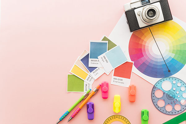 The way people can interact with your website says a lot about what you have to offer as a business.
For example, if your website has a simple design that highlights all of your website’s useful parts, you are utilizing your web design to the best of its ability.
This shows potential customers that you are precision-based and can offer them clean, useful services without outright saying those things.
Good web design is like wearing a good outfit on a first date. There is no need to say “I have my shit together” when you look like you have your shit together.
Arguably, looks can be deceiving, but at least with a good first impression, potential customers are likely to come back for more.
All Signs Point to Your Landing Page
Say you have created excellent content. You have posted that content on social media platforms, you’ve gotten featured in blogs on others’ websites, and you’re providing links to your landing pages.
Your content marketing strategy is pulling the people to your website. Now is the time for your web design to shine and move potential customers through your website.
One of the most critical parts of your web design is the ability to use your landing page as a jumping-off point, making your landing pages one of the most valuable assets of web design.
You don’t need to know everything about web design yourself. Many companies, both big and small, call on web design companies to create the most efficient website marketing practices. If you have questions about what makes a good web designer, we have some tips on finding the right web design company for you.
In short, a good web designer is capable of translating your business to a digital space while utilizing standard marketing techniques such as color psychology and spatial association. They also have a fine understanding of the different ways people will view your website and how to boost your website’s usability. Additionally, the right web designer for your business will know how to utilize your content and present it in a way that receives the most positive attention.
This type of web design knowledge is not only useful for creating a website that is aesthetically pleasing but for creating a website that converts visitors into customers.
The Humanness of Web Design
We are always searching for the best ways to tie human experience and digital marketing together. At the core of this idea is design.
For many years, the effects of different design elements have been studied to understand better how humans react and interact with design. One of the most prominent  examples is color psychology. There is an understanding that warm colors vs. cool colors evoke different responses and emotions from people. We often hear about the hypnotic colors of Walmart or Target. The organization of aisles to keep us moving and buying. The placement of products and signage. All of these physical elements have meaning. These ideas are the same in digital form. In marketing, we are trying to keep customers intrigued by and moving through our websites.
As humans, we give color, patterns, and places meaning. We are always attempting to give our experiences meaning, regardless of how big or small.
With web design or any other type of design within content marketing, we aim to attach meaning to the experience we give our potential customers, so they find value in it.
Additionally, when you consider general branding, consider the way your brand is presented and what the design aspects, including color, say about your brand.
The common associations between color and feeling are just human nature. This is where we must pay extra close attention to appeal.
We want to appeal to the senses. We want to utilize the attraction humans have to specific colors and items. We want to create a website that opens the users’ minds up and encourages exploration so that the time spent on the website is desirable, thus appealing.
The difference between good & bad website marketing
Good web design:
- Converts website visits into sales.
- Keeps your audience on your page longer.
- Provides a clear understanding to customers of what you have to offer.
- Presents your business to the digital world with the same care your business provides elsewhere.
- Creates a professional image for your business.
- Takes the personality of your business and turns it into a marketing experience.
- Makes life just a little easier.
Bad web design:
- Doesn’t represent your business or what you specifically have to offer.
- Focuses on the information far more than the presentation of the information.
- Makes using your website confusing, offering a bad user experience that can be hard to recover from.
- Underutilizes existing content/doesn’t realize how to utilize content for the sake of design and presentation properly.
- Lacks cohesiveness.
- Is too busy, muddling the content that could be beneficial if it were more prominent.
People do not have time to:
- Dig for the content they’re looking for on your website.
- Sort through endless content for nuggets of gold.
- Click through websites with nothing of value to offer.
- Look at content that isn’t relevant to what your business offers.
You could have the best content in the world, but if you are not presenting your content in the best possible way, people will turn elsewhere. You must first gauge your audience’s attention in the easiest way possible: good design.
Never skimp on good design because it is the primary driver of making a marketable business.
How Gravity Junction Can Help
Gravity Junction is a content marketing company that emphasizes design development and web design services. At Gravity Junction, we take every bit of your business into account to bring more traffic to your website through organic content marketing. Here, at Gravity Junction, we understand the human approach to digital marketing and use that to the best of our ability. At the forefront of every marketing approach we take, from content marketing to website marketing, we emphasize the power of design and its impact on human behavior. Let us help you add the most human approach to your digital marketing strategy. Contact us today.




 The way people can interact with your website says a lot about what you have to offer as a business.
 examples is color psychology. There is an understanding that warm colors vs. cool colors evoke different responses and emotions from people. We often hear about the hypnotic colors of Walmart or Target. The organization of aisles to keep us moving and buying. The placement of products and signage. All of these physical elements have meaning. These ideas are the same in digital form. In marketing, we are trying to keep customers intrigued by and moving through our websites.



0 Comments